Windows & Chrome
Native chrome (window titlebars, toolbars, and sidebar splits) is built from ordinary widget
intrinsics, declared as JSX children (see App Model). This page covers
the two-pane sidebar/content <splitview> shape. A third list pane and a <menubar> widget
compose into the same chrome; see Menu Bar and
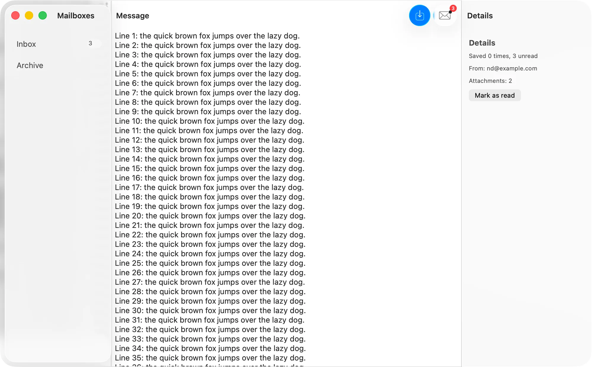
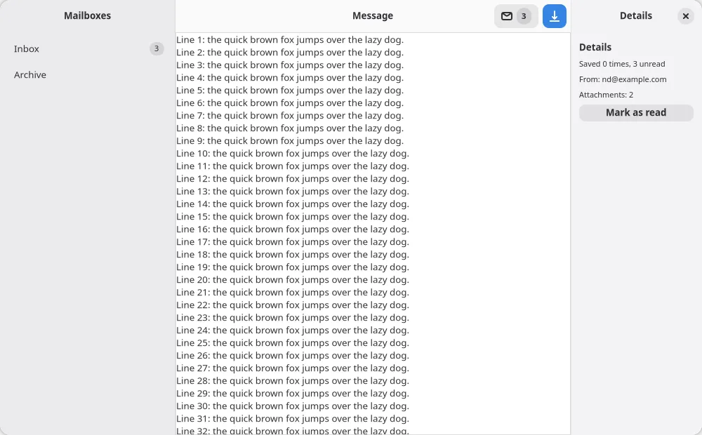
Split Views. Both examples/notes/main.tsx and
examples/gallery/ exercise the two-pane shape end to end on both platforms.
<window>
Section titled “<window>”The JSX root of an app. title, defaultWidth, and defaultHeight are honored on both platforms;
title is live-updatable, the size props are create-only (they set the initial window size, not a
constraint). See the Widget Reference for the full
prop table. Multiple <window> roots open multiple OS windows,
and windows sharing a tabGroup render as one tabbed window with
native system tabs.
The window’s root child is inset by the platform’s standard content margin (20pt on AppKit, 12px on
GTK), so a button’s corners are not sliced by the window frame and a label’s first glyph is not half
off-screen. Two opt-outs on both backends: a root built around something that scrolls runs edge to
edge (GTK counts a <terminal> or <webview> root as edge-to-edge too), and a root you padded
yourself keeps exactly the padding it asked for rather than getting both.
On GTK, a <window> whose tree declares no <headerbar> gets a framework AdwHeaderBar bound to
the window title. AdwApplicationWindow draws no titlebar of its own, so without one the window has
nothing to drag by and no close button. A tree that declares its own <toolbarview> or
<headerbar> is left alone and never gets a second bar.
Three create-only props shape the window chrome further:
toolbarStyle(unifieddefault,unifiedCompact,expanded,preference) picks the macOSNSWindow.ToolbarStyleonce a<headerbar>attaches the unified toolbar. A settings window declarespreferenceand gets labelled toolbar items with the window title visible. Theunifiedstyles keep the transparent-titlebar sidebar treatment and draw their toolbar items icon-only, with each item’s label reaching the overflow menu and VoiceOver instead. GTK’s native chrome is the oneAdwHeaderBaridiom, so the prop is inert there.frameAutosaveNamepersists the window’s frame across launches under that key (NSWindow.setFrameAutosaveName), and doubles as the toolbar-customization autosave key: with it set, the unified toolbar allows user customization and saves the configuration. GTK4 dropped session geometry persistence; persist sizes with the settings store there.density(standarddefault,compact) opts the window’s content into compact control metrics (prefersCompactControlSizeMetricson macOS 26+, a tightened CSS block on GTK).
<splitview>: sidebar + content
Section titled “<splitview>: sidebar + content”<splitview sidebarWidth={0.28}> takes two children, distinguished by the slot attached prop
(sidebar or content):
<splitview sidebarWidth={0.28}> <toolbarview slot="sidebar">…</toolbarview> <toolbarview slot="content">…</toolbarview></splitview>- On Linux, this is a real
AdwOverlaySplitView; the window runs as anAdwApplicationWindowso the split fills edge-to-edge, GNOME-style. - On macOS, this is a real
NSSplitViewController-managed split (using thesidebarWithViewController:API), which is what gives the sidebar system vibrancy/Liquid Glass material rather than a manually composited effect view.
collapsed is live-updatable on both; sidebarWidth sets the initial split proportion at creation.
<toolbarview> + <headerbar>: per-pane headers
Section titled “<toolbarview> + <headerbar>: per-pane headers”Each pane is wrapped in a <toolbarview> (AdwToolbarView on Linux) whose first child is a
<headerbar>, so the sidebar and the content pane each carry their own header instead of one
shared window titlebar:
<toolbarview slot="sidebar"> <headerbar> <button iconName="document-new" onClick={createNote} slot="start" /> </headerbar> {/* sidebar content */}</toolbarview>The two platforms render this identically shaped tree differently:
- On Linux, each
<toolbarview>adds its<headerbar>as a real top bar (AdwToolbarView.addTopBar), giving two independentAdwHeaderBars, one per pane. That is the native GNOME idiom for a sidebar app. - On macOS, the two
<headerbar>s do not each create their own bar. Their items merge into one unifiedNSToolbarspanning the window’s top edge, split by anNSTrackingSeparatorToolbarItemaligned to the split’s divider: the sidebar’s items left of it, the content pane’s right of it. This is the native macOS idiom (Notes, Mail), achieved via.fullSizeContentViewandtitlebarAppearsTransparentso the sidebar’s vibrancy reaches the very top, with the traffic-light window controls floating over it.
<headerbar title="…"> sets the pane’s title and updates in place. On macOS every pane’s header
contributes its own title item to the shared toolbar, sidebar, list, and inspector panes included.
On children, the slot attached prop (start/end) positions items on either side of the title.
On macOS, header <button> children are promoted to system-drawn toolbar items with no embedded
custom view. The Tahoe item glass is the only bezel, runs of adjacent buttons group into one
NSToolbarItemGroup, every item carries a real label for the overflow menu and VoiceOver (derived
from the button’s label, tooltip, or icon name), and the prominent and badge Button props render
as .prominent tint and a native NSItemBadge. Non-interactive header children (labels, spinners,
images) opt out. A <togglebutton> keeps its own view so its on/off state stays visible.
Inspector pane and edge-to-edge content
Section titled “Inspector pane and edge-to-edge content”<splitview> also accepts a slot="inspector" pane, the HIG utility pane alongside content. It is
edge-to-edge glass, unlike the sidebar’s floating pane. On macOS it is a real
NSSplitViewItem(inspectorWithViewController:) pinned to the trailing edge with no tracking
separator on its divider; on GTK it renders as an end-positioned AdwOverlaySplitView sidebar.
examples/inspector/ exercises it alongside prominent and badge toolbar items.
Panes whose content root scrolls (a <scrollview>, <textarea>, or a box holding just one)
extend edge-to-edge under the floating glass chrome: the scroll view insets its content via the
safe area, so content passes under the toolbar and AppKit draws the scroll edge effect, with the
pane’s background mirrored into the unsafe regions (NSBackgroundExtensionView). Non-scrolling
panes keep the safe-area inset so controls never start under the titlebar.
A list pane’s frame extends under the floating glass sidebar (the pane background is what the
glass blurs) while its layout stays inset past it. List and plain content panes also drop the hard
1px titlebar separator, since the scroll edge effect draws that boundary instead. A
<toolbarview slot="top"> or slot="bottom" bar inside a pane is hosted as a real
NSSplitViewItemAccessoryViewController, which is what puts the fade under it: AppKit applies the
effect under toolbar items and split item accessories, and a bar stacked as a plain subview gets
none.
Not implemented yet
Section titled “Not implemented yet”A <window> composing more than one independent split. The three-pane <splitview>
(sidebar/list/content) and the <menubar> widget have landed; see
Split Views and Menu Bar.