Build a Settings Window
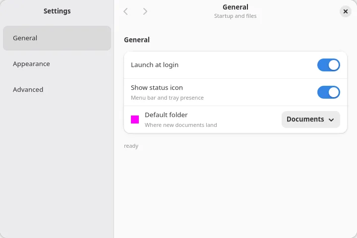
You build a two-page settings window: a sidebar that switches pages, native settings rows with switches and sliders, values that persist across launches, and a native confirmation dialog on the reset button.
Prerequisites: a project from the Quick Start and the
Counter tutorial. The code goes in src/main.tsx.
1. Split the window
Section titled “1. Split the window”Settings windows are a sidebar plus a content pane. <splitview> is the real native split
(NSSplitView on macOS, AdwOverlaySplitView on GNOME), and each pane carries its own header via
<toolbarview>:
import { render, useState } from "@nativedesktop/react";
const pages = [  { id: "general", label: "General", blurb: "Startup and status" },  { id: "appearance", label: "Appearance", blurb: "Theme and text" },] as const;
function App() {  const [pageIndex, setPageIndex] = useState(0);  const page = pages[pageIndex] ?? pages[0];
  return (    <window title="Settings" defaultWidth={720} defaultHeight={480}>      <splitview sidebarWidth={0.32} breakpoint={480}>        <toolbarview slot="sidebar">          <headerbar title="Settings" />          <sourcelist            items={pages.map((p) => ({ title: p.label }))}            selectedIndex={pageIndex}            onSelectionChanged={(e) => setPageIndex(e.index)}            style={{ vexpand: true }}          />        </toolbarview>        <toolbarview slot="content">          <headerbar title={page.label} subtitle={page.blurb} />          <label text={`The ${page.label} page`} style={{ vexpand: true }} />        </toolbarview>      </splitview>    </window>  );}
await render(<App />);
Three things to notice:
<sourcelist>is the platform’s navigation list, with controlled selection:selectedIndexin,onSelectionChangedout.breakpoint={480}collapses the sidebar automatically when the window gets narrower than 480 points.<headerbar title subtitle>on the content pane: both update in place, so the header follows the selected page with nokeyand no remount.
Run bun run dev and click between the pages.
2. Add settings rows
Section titled “2. Add settings rows”Replace the content placeholder with real settings chrome: <settingsgroup> renders a titled group
of rows (AdwPreferencesGroup on GNOME, the grouped settings style on macOS), and <switchrow> is
a row with a built-in toggle. <clamp> caps the content width so rows do not stretch across a wide
window.
Add the settings shape and state above App:
interface Settings {  launchAtLogin: boolean;  showStatusIcon: boolean;  themeIndex: number;  textSize: number;}
const defaults: Settings = {  launchAtLogin: false,  showStatusIcon: true,  themeIndex: 0,  textSize: 14,};
Inside App, hold the settings in state with one typed updater:
const [settings, setSettings] = useState<Settings>(defaults);
function set<K extends keyof Settings>(key: K, value: Settings[K]) {  setSettings((prev) => ({ ...prev, [key]: value }));}
Then swap the content pane’s <label> for the General page:
<scrollview minContentHeight={380} style={{ vexpand: true }}> <clamp maximumSize={560}> <box orientation="vertical" spacing={18} style={{ hexpand: true, padding: { top: 18, bottom: 18, left: 12, right: 12 } }} > {page.id === "general" && ( <settingsgroup title="General"> <switchrow title="Launch at login" checked={settings.launchAtLogin} onToggled={(e) => set("launchAtLogin", e.checked)} /> <switchrow title="Show status icon" subtitle="Menu bar and tray presence" checked={settings.showStatusIcon} onToggled={(e) => set("showStatusIcon", e.checked)} /> </settingsgroup> )} </box> </clamp></scrollview>3. Fill the Appearance page
Section titled “3. Fill the Appearance page”A plain <row> carries a title and an optional subtitle, and places any child widget in its
trailing slot. Add the Appearance page next to the General block:
{page.id === "appearance" && ( <settingsgroup title="Appearance" description="Changes apply immediately."> <row title="Theme"> <select options={themes} selectedIndex={settings.themeIndex} onSelectionChanged={(e) => set("themeIndex", e.index)} /> </row> <row title="Text size" subtitle={`${Math.round(settings.textSize)}pt`}> <slider min={10} max={24} step={1} value={settings.textSize} onValueChanged={(e) => set("textSize", e.value)} style={{ hexpand: true }} /> </row> </settingsgroup>)}with the options at module scope:
const themes = ["System", "Light", "Dark"];hexpand on the slider propagates into the row’s trailing area, so the track gets usable width.
GNOME’s own settings sliders do the same.
4. Persist with createStore
Section titled “4. Persist with createStore”Right now every launch starts from defaults. createStore gives you a versioned JSON file under
the app’s data directory, with debounced, crash-safe writes and a flush on exit.
Replace the useState with a store at module scope:
import { createStore, render, useState, useStoreValue } from "@nativedesktop/react";
const store = createStore<Settings>({ name: "settings", version: 1, defaults });
Inside App, read it with useStoreValue and write through the store:
const settings = useStoreValue(store);
function set<K extends keyof Settings>(key: K, value: Settings[K]) {  store.update((prev) => ({ ...prev, [key]: value }));}
Load it once, before rendering:
await store.load();await render(<App />);Loading before render() makes store.get() synchronous inside components: no loading flash, no
restore effect. The file lands at settings.json under the app data dir, which is
~/Library/Application Support/<name> on macOS and ~/.local/share/<name> on Linux, where
<name> comes from your package.json. When you later change the shape, bump version and add a
migrate hook; it runs on every load and returns the upgraded value, or null to reset.
Toggle a switch, quit, and run again. The values come back.
5. Confirm the reset with a native dialog
Section titled “5. Confirm the reset with a native dialog”Dialog helpers are promise-wrapped commands on a <window>. They need two pieces of wiring: a ref
to the window node, and the window’s onAlertResult prop routed back into the helper so the
promise can settle.
import { createStore, onAlertResult, render, showAlert, useRef, useState, useStoreValue,} from "@nativedesktop/react";import type { NdNodeRef } from "@nativedesktop/react";const winRef = useRef<NdNodeRef<"window">>(null);
async function confirmReset() { const win = winRef.current; if (!win) return; const result = await showAlert(win, { title: "Reset all settings?", body: "Every option returns to its default value.", buttons: [ { id: "cancel", label: "Cancel" }, { id: "reset", label: "Reset", style: "destructive" }, ], }); if (result.buttonId === "reset") store.set(defaults);}<window ref={winRef} title="Settings" defaultWidth={720} defaultHeight={480} onAlertResult={(e) => onAlertResult(winRef.current!, e)}>And the button, after the two page blocks:
<button label="Reset All Settings" onClick={confirmReset} cssClasses={["destructive-action"]} style={{ halign: "start" }}/>showAlert shows a real native sheet (NSAlert on macOS, AdwAlertDialog on GNOME) and resolves
with the id of the clicked button. One dialog per window can be pending at a time; a second call
while one is open rejects instead of queueing.
Run it
Section titled “Run it”bun run dev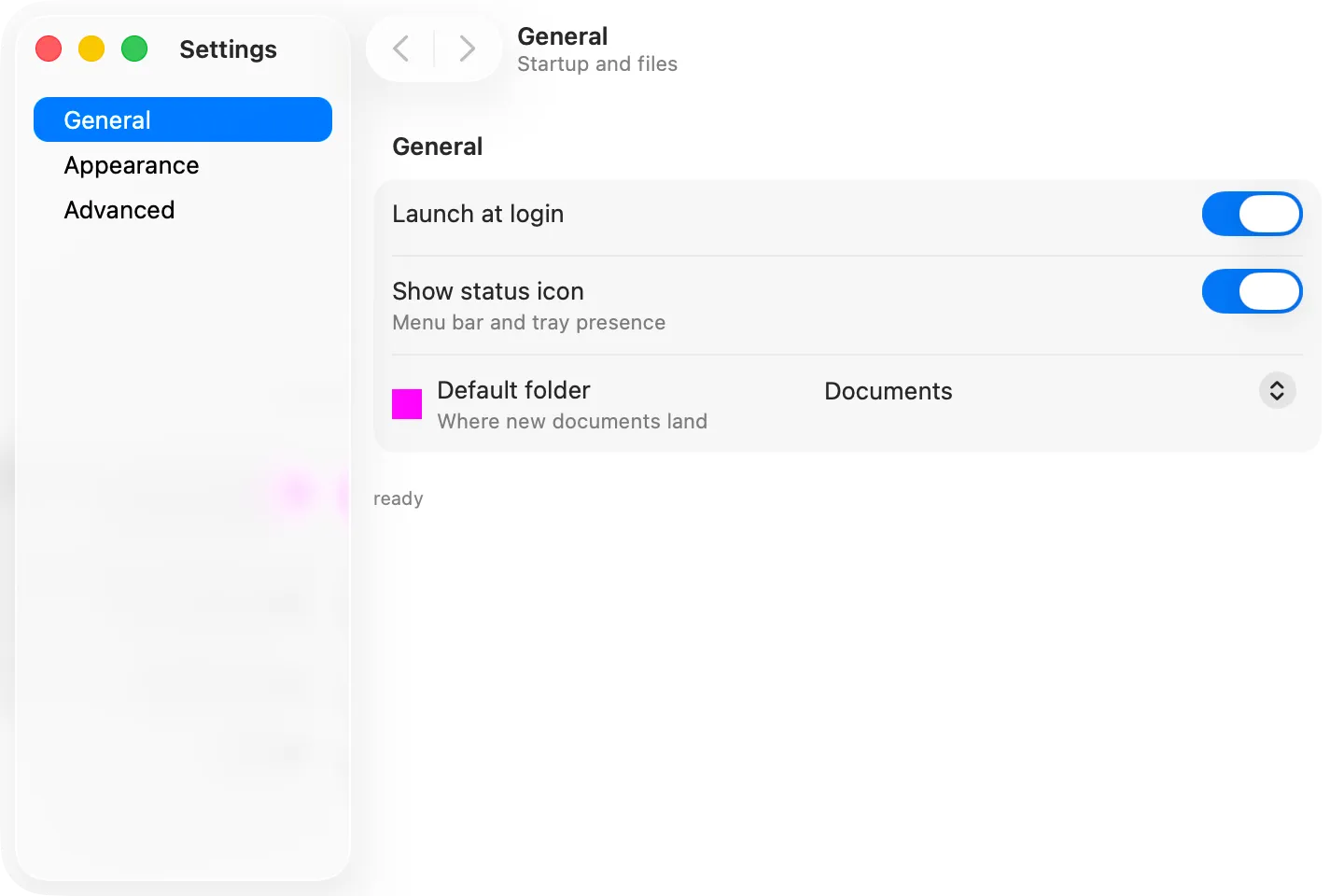
The finished file:
import {  createStore,  onAlertResult,  render,  showAlert,  useRef,  useState,  useStoreValue,} from "@nativedesktop/react";import type { NdNodeRef } from "@nativedesktop/react";
interface Settings {  launchAtLogin: boolean;  showStatusIcon: boolean;  themeIndex: number;  textSize: number;}
const defaults: Settings = {  launchAtLogin: false,  showStatusIcon: true,  themeIndex: 0,  textSize: 14,};
const store = createStore<Settings>({ name: "settings", version: 1, defaults });
const pages = [  { id: "general", label: "General", blurb: "Startup and status" },  { id: "appearance", label: "Appearance", blurb: "Theme and text" },] as const;
const themes = ["System", "Light", "Dark"];
function App() {  const settings = useStoreValue(store);  const [pageIndex, setPageIndex] = useState(0);  const winRef = useRef<NdNodeRef<"window">>(null);  const page = pages[pageIndex] ?? pages[0];
  function set<K extends keyof Settings>(key: K, value: Settings[K]) {    store.update((prev) => ({ ...prev, [key]: value }));  }
  async function confirmReset() {    const win = winRef.current;    if (!win) return;    const result = await showAlert(win, {      title: "Reset all settings?",      body: "Every option returns to its default value.",      buttons: [        { id: "cancel", label: "Cancel" },        { id: "reset", label: "Reset", style: "destructive" },      ],    });    if (result.buttonId === "reset") store.set(defaults);  }
  return (    <window      ref={winRef}      title="Settings"      defaultWidth={720}      defaultHeight={480}      onAlertResult={(e) => onAlertResult(winRef.current!, e)}    >      <splitview sidebarWidth={0.32} breakpoint={480}>        <toolbarview slot="sidebar">          <headerbar title="Settings" />          <sourcelist            items={pages.map((p) => ({ title: p.label }))}            selectedIndex={pageIndex}            onSelectionChanged={(e) => setPageIndex(e.index)}            style={{ vexpand: true }}          />        </toolbarview>
        <toolbarview slot="content">          <headerbar title={page.label} subtitle={page.blurb} />          <scrollview minContentHeight={380} style={{ vexpand: true }}>            <clamp maximumSize={560}>              <box                orientation="vertical"                spacing={18}                style={{ hexpand: true, padding: { top: 18, bottom: 18, left: 12, right: 12 } }}              >                {page.id === "general" && (                  <settingsgroup title="General">                    <switchrow                      title="Launch at login"                      checked={settings.launchAtLogin}                      onToggled={(e) => set("launchAtLogin", e.checked)}                    />                    <switchrow                      title="Show status icon"                      subtitle="Menu bar and tray presence"                      checked={settings.showStatusIcon}                      onToggled={(e) => set("showStatusIcon", e.checked)}                    />                  </settingsgroup>                )}
                {page.id === "appearance" && (                  <settingsgroup title="Appearance" description="Changes apply immediately.">                    <row title="Theme">                      <select                        options={themes}                        selectedIndex={settings.themeIndex}                        onSelectionChanged={(e) => set("themeIndex", e.index)}                      />                    </row>                    <row title="Text size" subtitle={`${Math.round(settings.textSize)}pt`}>                      <slider                        min={10}                        max={24}                        step={1}                        value={settings.textSize}                        onValueChanged={(e) => set("textSize", e.value)}                        style={{ hexpand: true }}                      />                    </row>                  </settingsgroup>                )}
                <button                  label="Reset All Settings"                  onClick={confirmReset}                  cssClasses={["destructive-action"]}                  style={{ halign: "start" }}                />              </box>            </clamp>          </scrollview>        </toolbarview>      </splitview>    </window>  );}
await store.load();await render(<App />);- Build a Tabbed Terminal: the
<terminal>widget and native system tabs. - App Data & Storage: the store API in full, plus worker-backed SQLite.
- Dialogs: file pickers, save dialogs, and the About panel.