Build a Counter
You build a counter with increment and decrement buttons, a derived status line, and platform-native
button styling. Along the way you meet the four widgets every app starts with: <window>, <box>,
<label>, and <button>.
Prerequisites: a project from the Quick Start. The code goes in
src/main.tsx.
1. Create the window
Section titled “1. Create the window”Start with a static window:
import { render } from "@nativedesktop/react";
function Counter() {  return (    <window title="Counter" defaultWidth={480} defaultHeight={320}>      <box orientation="vertical" spacing={8}>        <label text="Count: 0" />      </box>    </window>  );}
await render(<Counter />);
A <window> is the root of the tree. <box> is the layout primitive: it stacks children
vertically or horizontally, and its spacing defaults to the platform’s standard gap when you omit
it. <label> renders text through a real native text widget.
2. Add state
Section titled “2. Add state”Wire the count to useState and add a button:
import { render, useState } from "@nativedesktop/react";
function Counter() {  const [count, setCount] = useState(0);
  return (    <window title="Counter" defaultWidth={480} defaultHeight={320}>      <box orientation="vertical" spacing={8}>        <label text={`Count: ${count}`} />        <button label="Increment" onClick={() => setCount((c) => c + 1)} />      </box>    </window>  );}
await render(<Counter />);
The hook comes from @nativedesktop/react, not react. That is the one import rule in
NativeDesktop; it keeps hooks working across hot reloads
(why).
Clicking the button fires a native click event in the host process. It crosses the socket to your React process, runs your handler, and the resulting commit crosses back. You never notice the trip.
3. Derive, don’t store
Section titled “3. Derive, don’t store”Values computed from state are computed inline, not stored in more state. Add a parity line under the count:
const parity = count % 2 === 0 ? "even" : "odd";<label text={`Count: ${count}`} /><label text={`That is ${parity}.`} cssClasses={["dimmed"]} />cssClasses is the styling escape hatch into each platform’s design language. The names come from
libadwaita’s vocabulary; on macOS they map onto real AppKit control properties. dimmed renders
secondary text the way each platform dims it.
4. Style the buttons
Section titled “4. Style the buttons”Add a decrement button and group both in a horizontal box:
<box orientation="horizontal" spacing={8} style={{ halign: "center" }}> <button label="Decrement" onClick={() => setCount((c) => c - 1)} /> <button label="Increment" onClick={() => setCount((c) => c + 1)} cssClasses={["suggested-action"]} /></box>suggested-action marks the primary action: the accent-colored button on GNOME, the default button
treatment on macOS. style is not CSS; it covers theme-neutral geometry and alignment like
halign.
The finished file:
import { render, useState } from "@nativedesktop/react";
function Counter() {  const [count, setCount] = useState(0);  const parity = count % 2 === 0 ? "even" : "odd";
  return (    <window title="Counter" defaultWidth={480} defaultHeight={320}>      <box orientation="vertical" spacing={8}>        <label text={`Count: ${count}`} />        <label text={`That is ${parity}.`} cssClasses={["dimmed"]} />        <box orientation="horizontal" spacing={8} style={{ halign: "center" }}>          <button label="Decrement" onClick={() => setCount((c) => c - 1)} />          <button            label="Increment"            onClick={() => setCount((c) => c + 1)}            cssClasses={["suggested-action"]}          />        </box>      </box>    </window>  );}
await render(<Counter />);
Run it
Section titled “Run it”bun run devThe same file renders in each platform’s own design language:
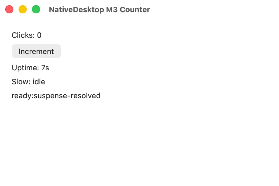
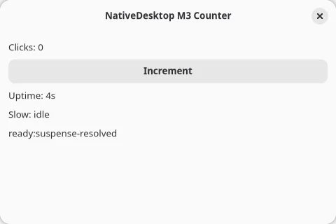
Leave it running and edit the parity strings. The window updates in place and the count survives the edit.
- Build a Settings Window: sidebar navigation, settings rows, persistence, and dialogs.
- Styling & Design Language: the full
cssClassesvocabulary and whatstylecovers.